Mor Sirkis
Mor Sirkis
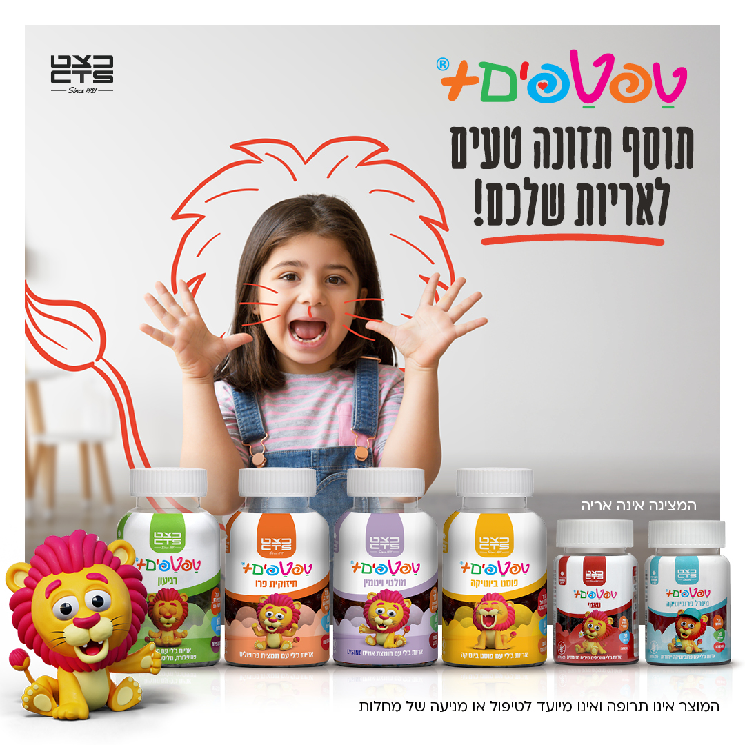
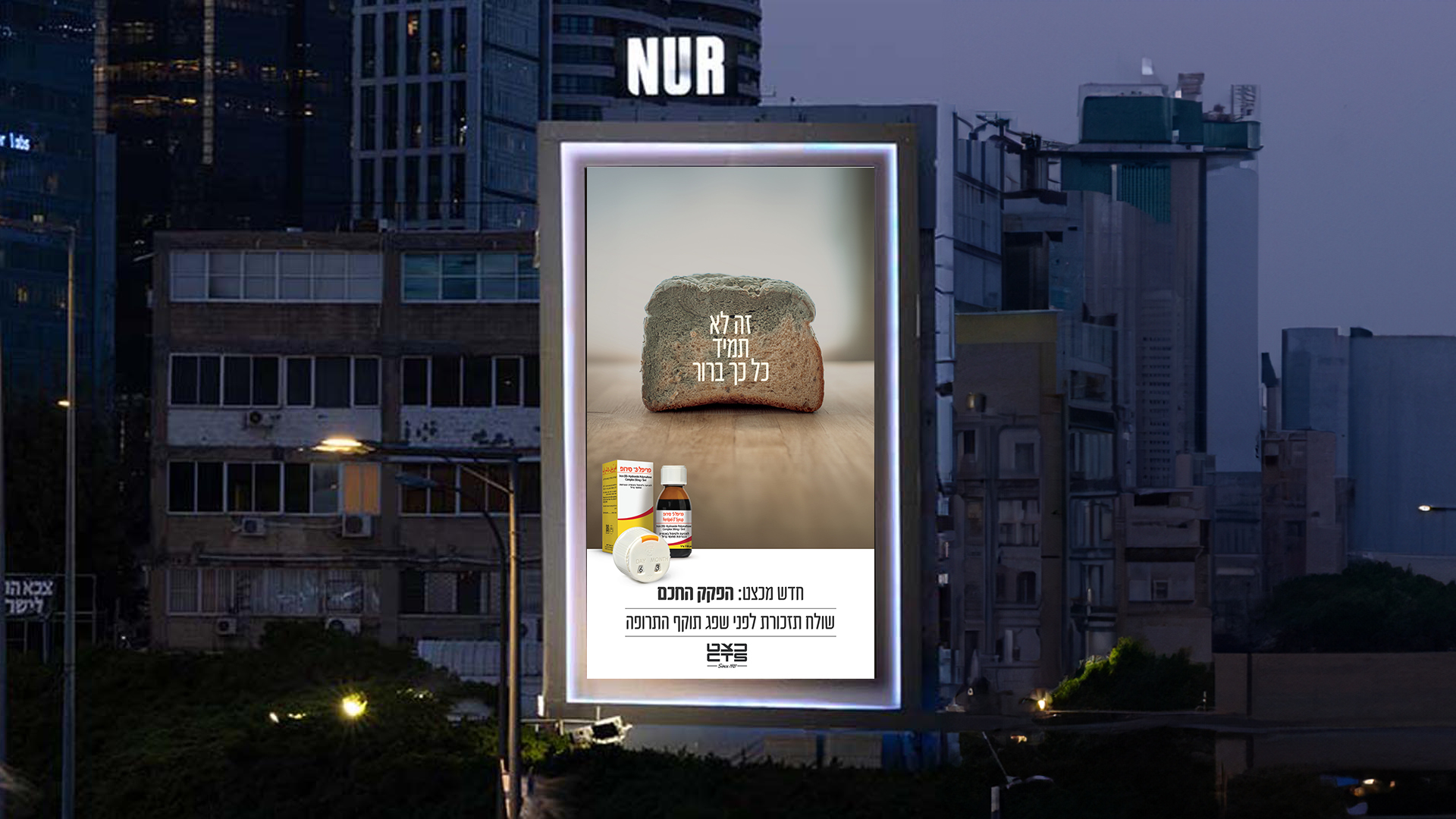
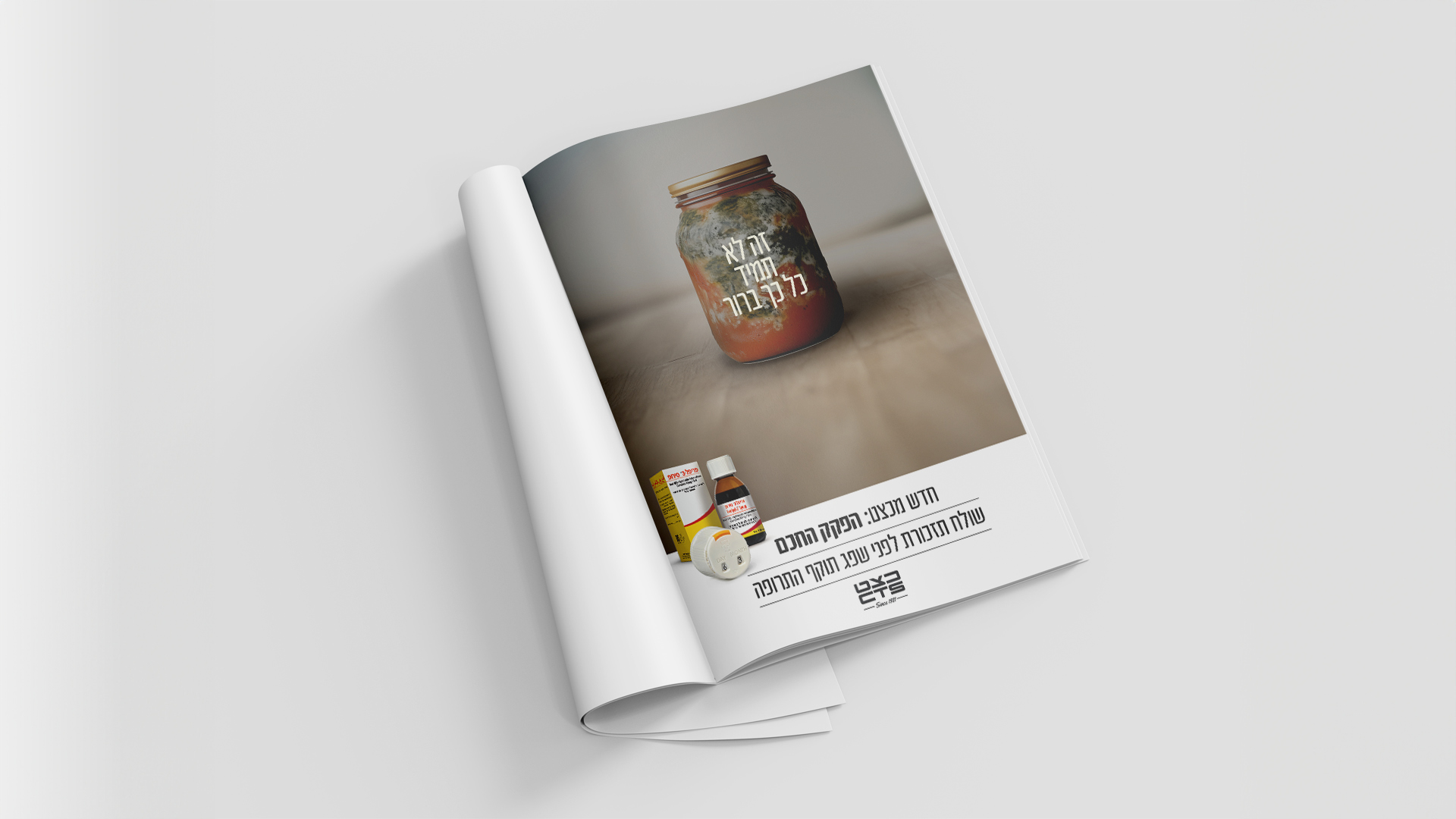
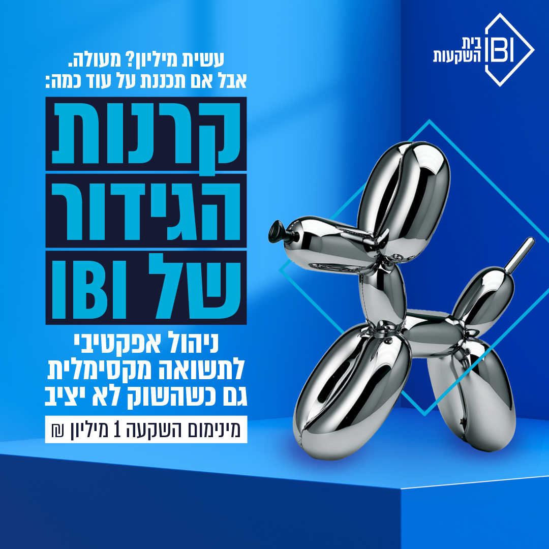
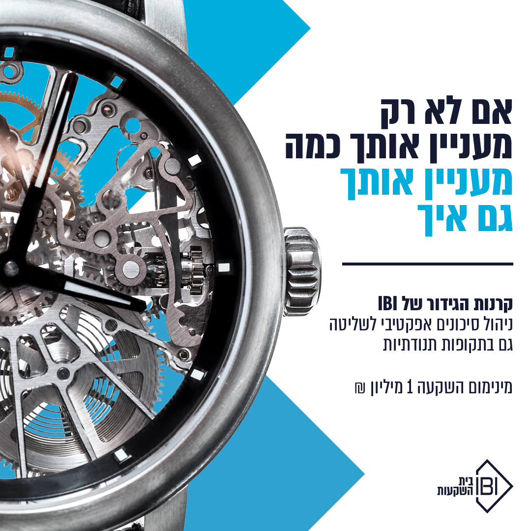
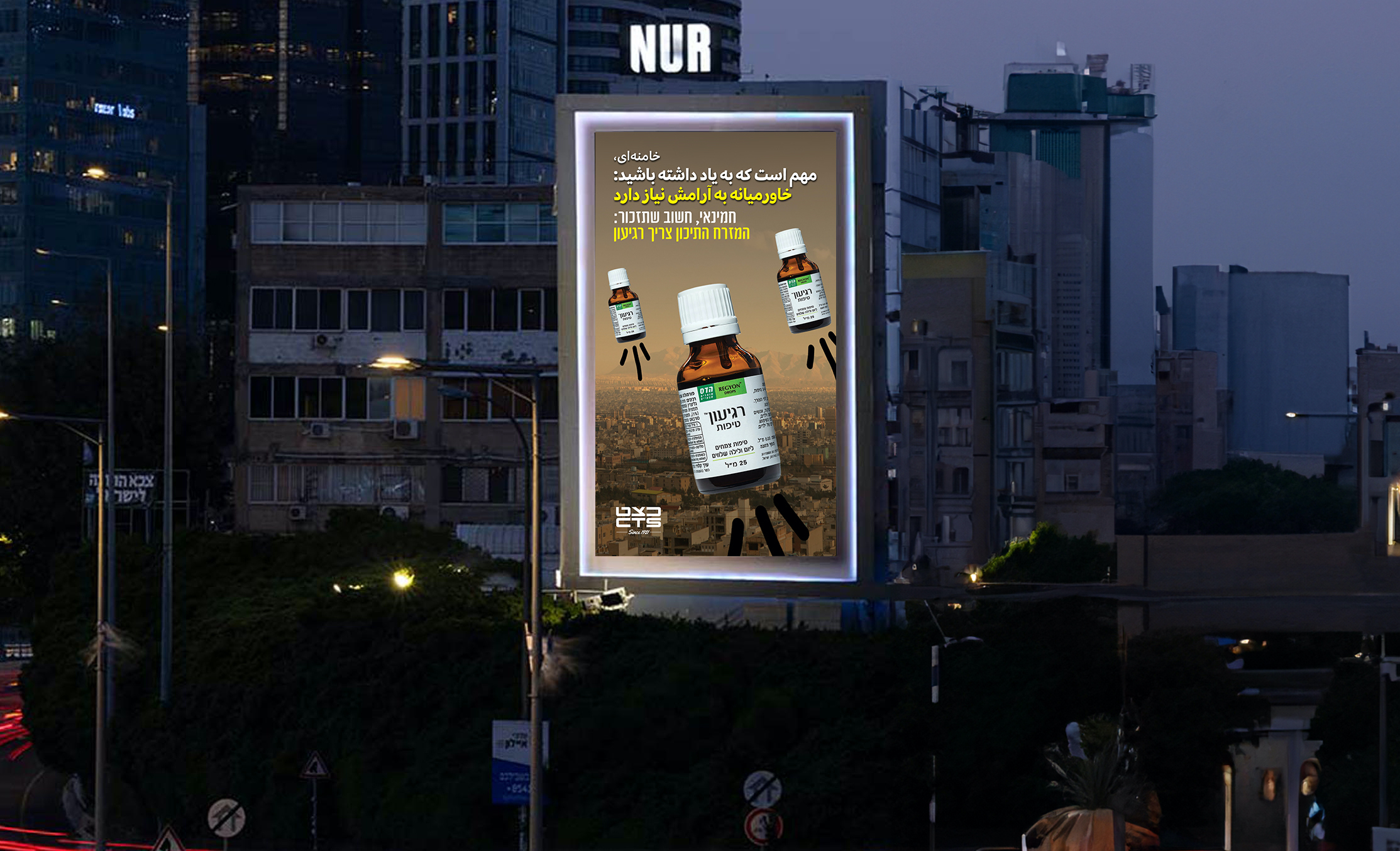
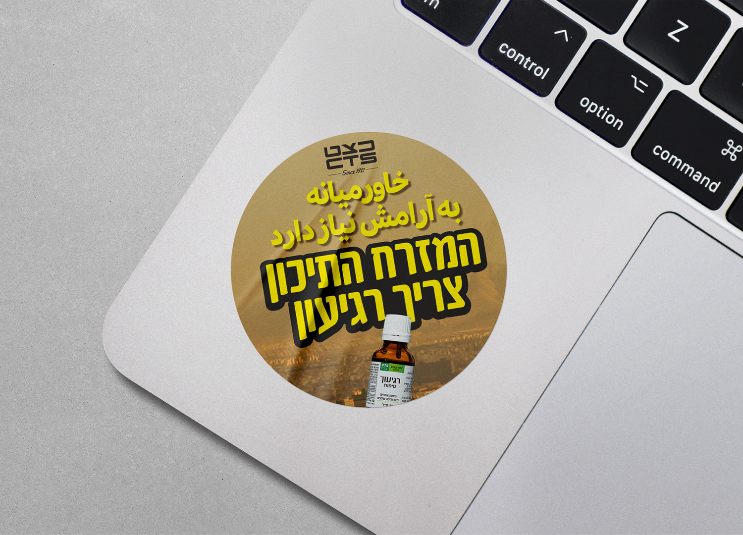
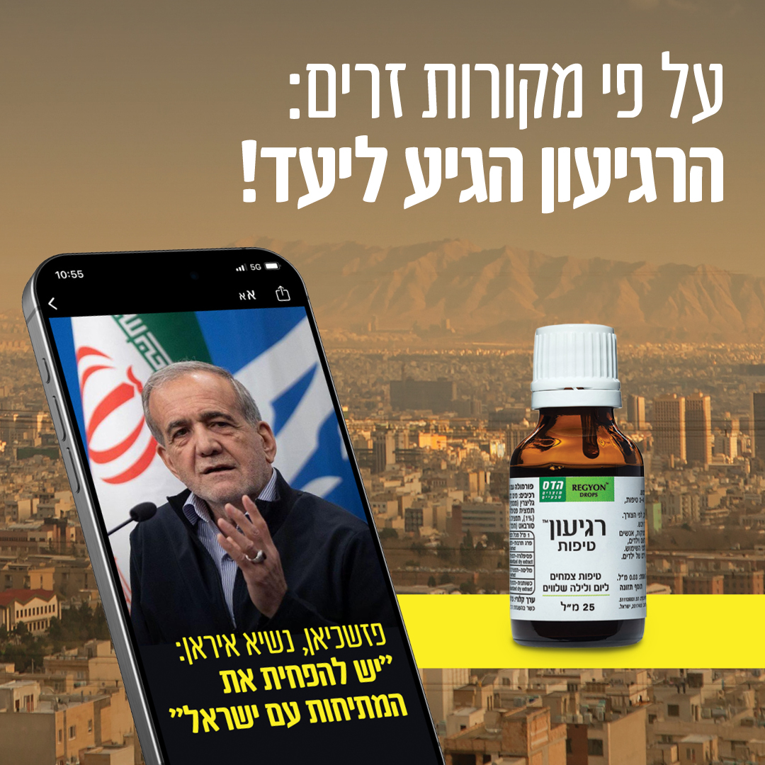
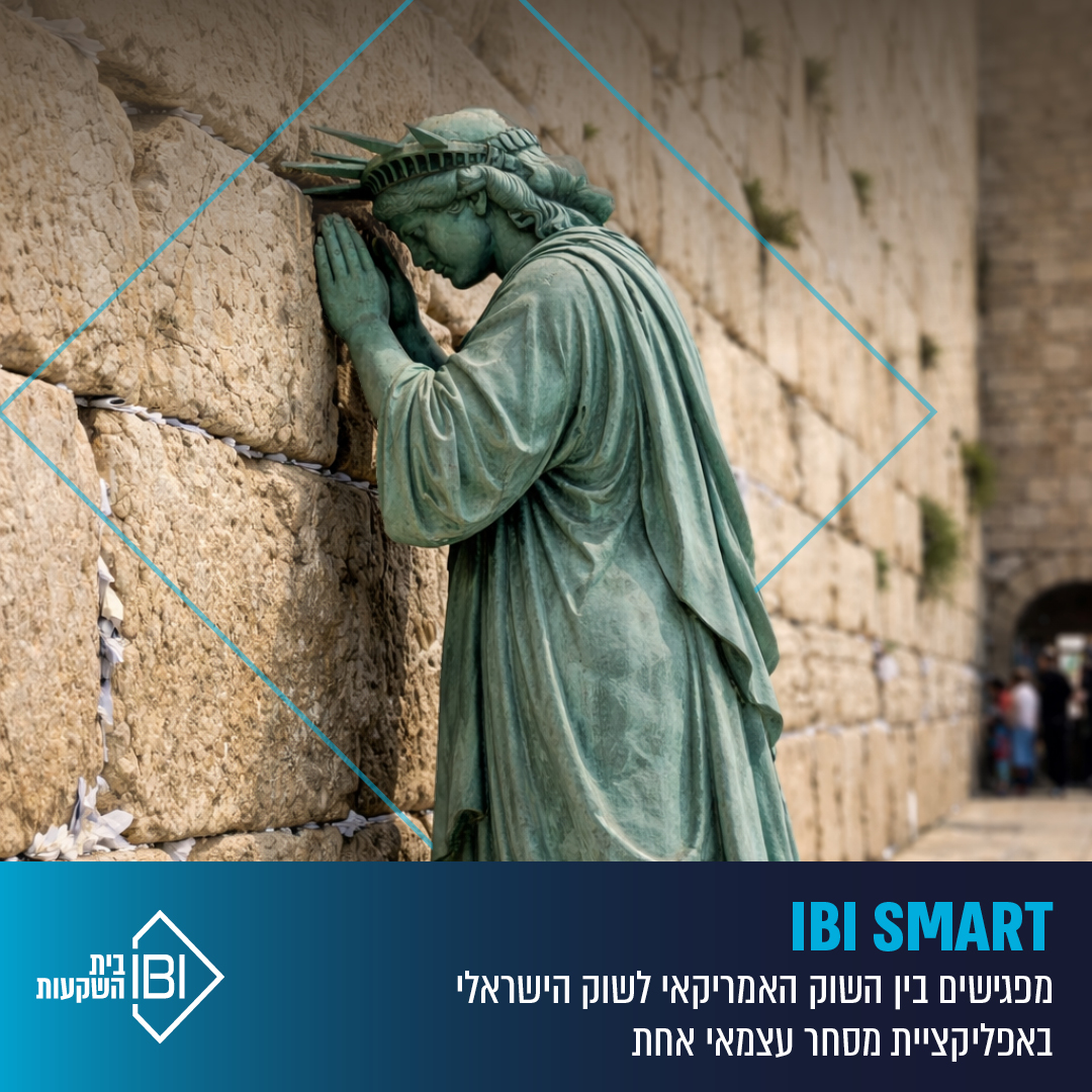
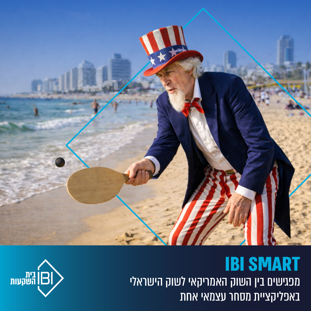
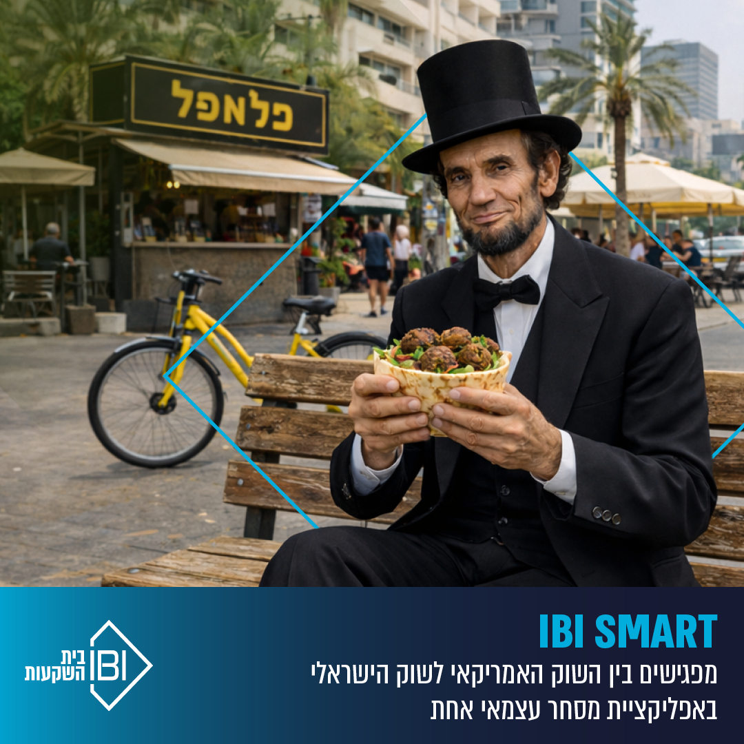
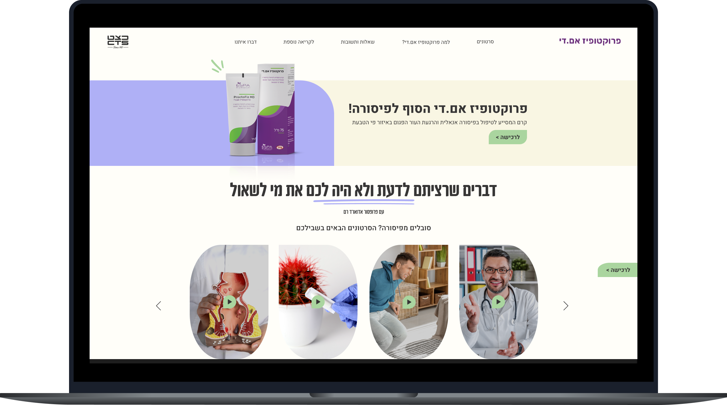
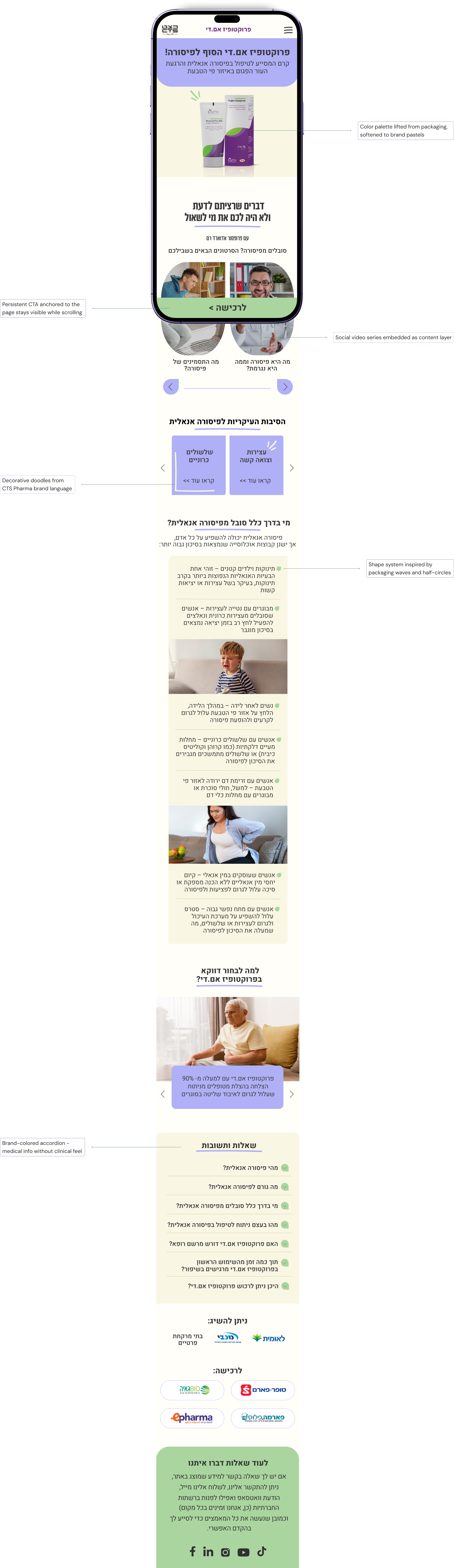
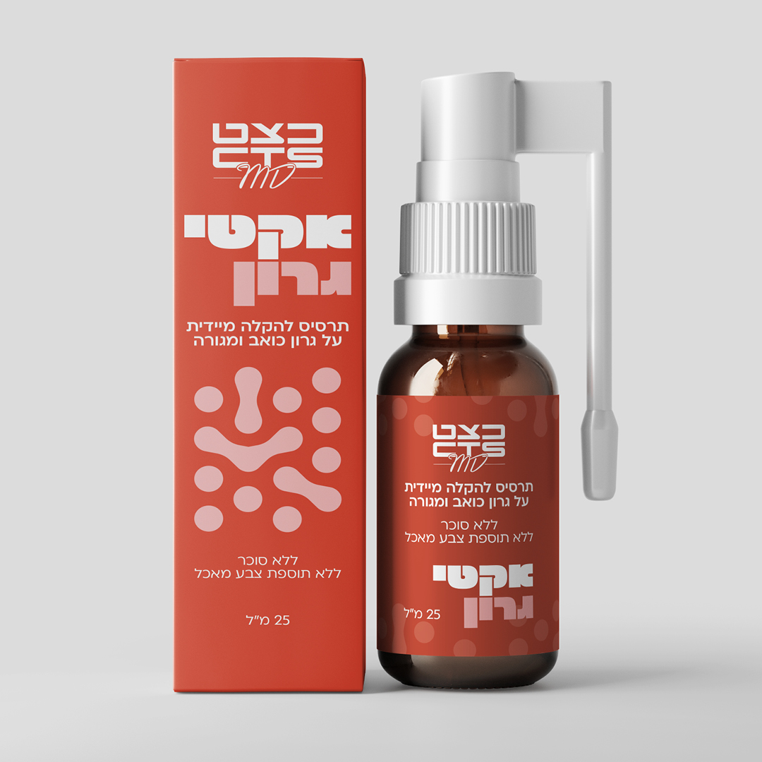
Three years at Yehoshua/TBWA - starting in the studio and moving into the creative department. The projects ranged from pharma packaging to TV spots, social campaigns to brand identity.
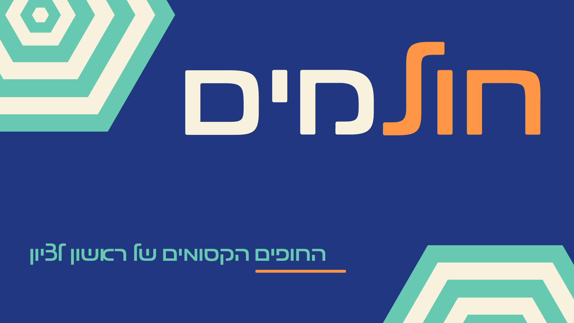
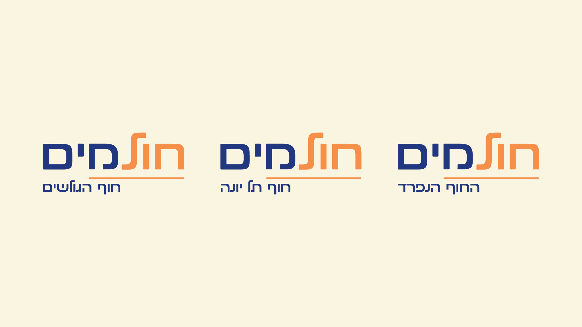
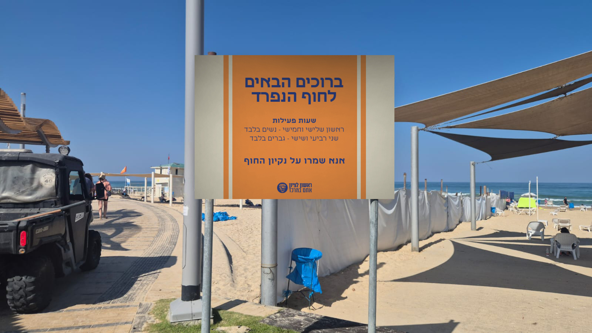
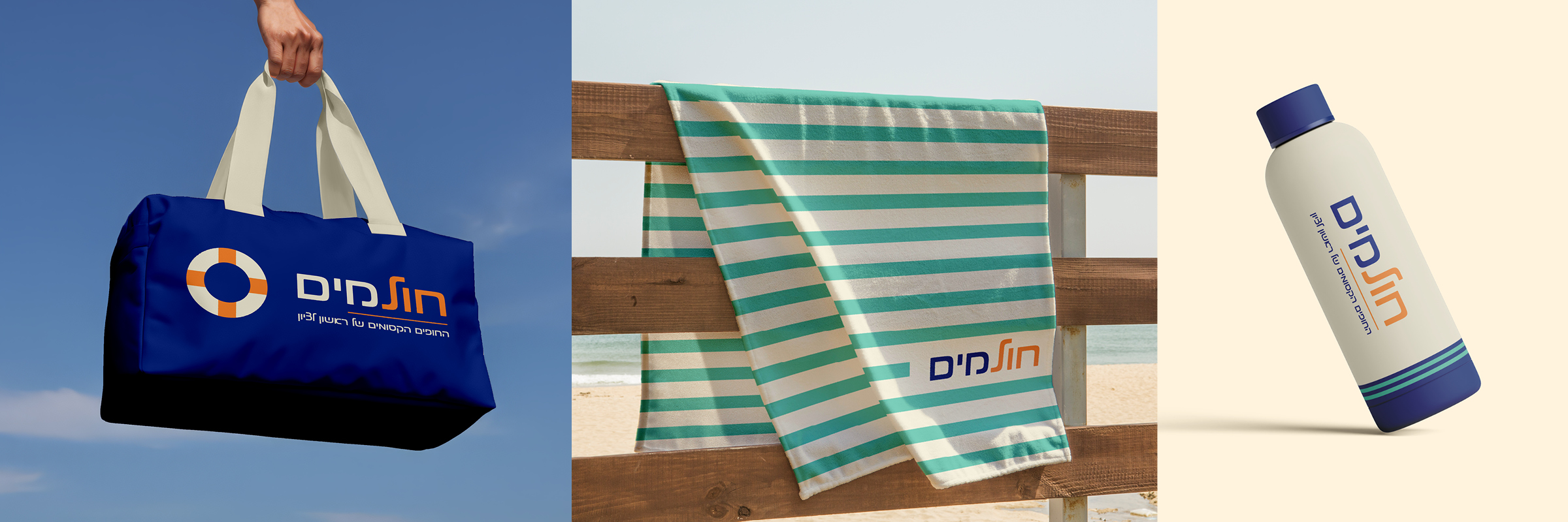
I don't arrive at a project with a signature style. I arrive with a process: read the brand, work inside its visual language, then figure out where it has room to go further. That's the part I keep coming back to. Now looking to do more of it in branding and identity work.
Selected Work
Campaign for a calming supplement built around the idea that the Middle East could use some relaxation.
BRANDING
A complete brand system designed for an OTC pharmaceutical line, with a distinct color assigned to each product and a unified graphic language that carries across all packaging.
SOCIAL
IBI merged Israeli and US stock trading into a single app. American icons dropped into unmistakably Israeli situations — the Statue of Liberty at the Kotel, Uncle Sam on the beach, Lincoln with a falafel.
A pharma campaign for a smart pill cap that tracks opening time and reminds you when the medication expires — because with pills, you can't always tell.
UX/UI
A landing page for a high-volume currency exchange service, targeting investors who still convert through their bank.
SOCIAL
Social posts for a children's nutritional supplement brand — gummy bear vitamins shaped like lions, packed with vitamins and minerals.
TV
Three 6-second TV sponsorships for IBI Investment House. Each spot drops the brand name into a real everyday moment — the kind of mention that feels organic, not scripted.
WEB DESIGN
A landing page for Toyota Israel's sponsorship of the Tel Aviv Love Race, combining event content with product exposure for the AYGO X.
BRANDING
A full branding concept for a city's beaches — name, logo, signage, and merchandise, designed to create a unified identity for the waterfront.
Got a project in mind? I'd love to hear about it.
Thanks! I'll get back to you soon.
IBI Convert FX lets business owners convert dollars quickly - no brokerage account needed, no commission, starting from $100,000.
The brief started as a social campaign refresh. The concept was simple: dollar bills doing a facepalm. Each post a different bill, same punchline - why are you still converting through your bank? The series performed well enough that IBI came back and asked us to carry the visual language into a full landing page redesign, built for both desktop and mobile.
Social campaign - $100 bill. The series ran on paid channels across Instagram and Facebook
Each post featured a different bill - same facepalm energy, same question
Mobile landing page - full scroll, same visual language as the campaign
Art Direction - social campaign concept, AI image generation, landing page design (desktop & mobile)
CTS Pharma approached us to build awareness for Taptapim+, their children's nutritional supplement line: gummy bears shaped like lions, packed with vitamins, minerals, and amino acids.
The ask was social content that would cut through the noise of a crowded kids-health category. Instead of clinical claims, we leaned into play. The campaign centered on kids doing their best roaring lion impressions, hands up and mouths wide open, with doodle illustrations layered over the photos: a mane, whiskers, a tail, drawn right onto the child.
Light, loud, and completely on-brand. And yes — there's a small legal note on the image clarifying that the child shown is not, in fact, a lion.
Animated post — Multivitamin with Lysine
Static post — full product line
Art Direction — social campaign concept, doodle illustration, post design
CTS came to us with a new product: a smart bottle cap that tracks when a medication was first opened and alerts you when it's nearing expiration. The brief was to build a campaign concept to launch it.
Outdoor Billboard
The insight we came back with was simple: medication doesn't show expiration the way food does. A moldy orange is obvious. A pill bottle? Not so much.
We visualized that truth through macro-style images of spoiled food: bread, a jar of tomato sauce, a rotting orange. Not gross. Actually kind of gorgeous. The kind of image that stops you mid-scroll and makes you think twice about the pills in your cabinet.
The client ultimately went in a different direction. This was one of the creative concepts presented.
Magazine Ad
Social Media Post
Art Direction — campaign concept, visual language, print & social executions
When IBI Investment House joined the agency, research showed almost no public awareness of the brand. People simply didn't know who they were. The strategy: don't run one big expensive ad. Build frequency instead. Saturate the year with short TV and radio sponsorships that repeat the name constantly until it sticks. More effective, and far more cost-efficient than a one-off campaign.
The creative hook was a single catchphrase — ״התחלתי להשקיע ב-IBI״ — dropped into casual everyday moments, always by someone unexpected. Three 6-second spots, three situations, same punchline.
I joined the creative team on this second round of sponsorships. New situations, same proven format.
Two coworkers mid-meeting. She tells him she started investing — and the window cleaner outside catches the name first.
Two friends at a driving test. She shares her news — and the examiner's announcement does the talking.
Two dads at the playground. One mentions he started investing — and a little girl on the swing beats him to the punchline.
Art Direction — on-set
IBI came to us with a specific brief: promote their hedge funds to qualified investors, people with over 1M ILS in liquid assets. Not a mass audience. A small, sophisticated one that knows exactly what they're looking at.
The challenge was designing social posts that feel premium and intentional without being stiff. Content that earns a second look from someone who doesn't need to be impressed, but will notice when something is done right. All within the existing brand guidelines.
Post 1
Post 2
Post 3
Art Direction — social media campaign
September 2024. The Middle East is tense. CTS Pharma came to us with a product: Regyon, a natural herbal calming drops. We pitched a proactive idea - not to advertise to people who need calm, but to speak directly to the ones causing the chaos.
We designed a billboard that went up on the Ayalon highway, built in the visual language of Iranian propaganda posters - same ugly graphics, same colors, same energy. The copy was written in Farsi and Hebrew, addressed directly to Khamenei. Instead of missiles on the design, we put Regyon bottles.
In parallel, we sent an influencer to the Iranian embassy abroad with a branded package - bottles and stickers from the campaign. Shortly after, the headline dropped: Iran's president declared it was time to reduce tensions with Israel.
Ayalon highway billboard - addressed directly to Khamenei, written in Farsi and Hebrew, designed in the visual language of Iranian propaganda
Branded campaign stickers - sent with the package to the Iranian embassy abroad
Social activation - an influencer delivers the branded Regyon package to the Iranian embassy
RTB posted after the campaign went live - Iran's president announced intentions to reduce tensions with Israel. "According to foreign sources: the Regyon reached its destination"
Art Direction - campaign concept, billboard design, sticker design, social activation
IBI Investment House merged their Israeli and US stock market trading into a single app - what used to require two separate apps now lives in one place.
The brief was to communicate this to their audience in a way that felt fresh and surprising. We built a campaign series around a single concept: iconic American cultural figures dropped into unmistakably Israeli situations. Statue of Liberty at the Kotel. Uncle Sam playing matkot on the beach. Abraham Lincoln eating falafel on Rothschild.
The juxtaposition did the work. No need to over-explain - the image said it all. Two worlds, one app.
Statue of Liberty at the Western Wall - American icon, Israeli landmark, one app
Uncle Sam playing matkot on Tel Aviv beach - as Israeli as it gets
Abraham Lincoln on Rothschild Boulevard with a falafel - two cultures, one moment
Art Direction - campaign concept, AI image generation, post design
CTS Pharma needed a landing page for Proctofiz MD, their topical cream for anal fissures. The brief was to build something that felt genuinely informative - a page that could carry medical content about the condition alongside a series of expert videos they had already produced for social media.
The visual language came directly from the packaging. The brand palette is purple, green, and white - in the strong, saturated tones of the box. My job was to translate that into something softer and more approachable for a health audience: I pulled the same colors from CTS Pharma's broader brand palette, where they appear in pastel, and kept the color relationships intact.
The packaging also features waves and half-circles, so I carried those into the layout as a structural motif - shapes where each corner has a different border radius, giving the page a distinctive feel that ties back to the product. The decorative doodles scattered across the page also come from CTS Pharma's brand language. The client provided copy and content order. I handled everything else.
Desktop landing page - hero, expert video series, medical content sections, FAQ, and purchase links
Mobile landing page - full scroll with design decisions annotated
Web Design - visual language, layout, desktop and mobile
Toyota Israel sponsored the Tel Aviv Love Race, placing the AYGO X at the center of their campaign. This landing page was the digital hub for the event - combining race content and city-based episode navigation with product exposure for the car.
The brief, copy, and content structure came from the copywriter. I handled the full visual design within Toyota's brand guidelines: the dark palette, graphic shapes, and typography system were all defined. My work was in layout, composition, and building the hero as a dynamic system - the background and color language shift to match each of the car's available colors, so every version of the page feels considered rather than default.
Car imagery and spec content came from Toyota's global asset library.
Desktop landing page - hero, episode navigation, car specs and imagery
The hero section adapts to each car color - background graphic and palette shift dynamically across all available AYGO X versions
Mobile landing page - full scroll with design decisions annotated
Web Design - layout, hero color system, desktop and mobile
The brief was to build a full visual identity for a new OTC line - eight products, each targeting a different condition, with no inherent connection between them.
The challenge was structural: how do you create a system that reads as one brand on the shelf, while making it immediately clear which product is which - and standing out against competitors doing the same thing? I started with research, looking at OTC packaging in Israel and internationally to understand the conventions and where there was room to do something different.
The solution was a graphic language built from organic forms - shapes drawn from biology, molecules, the kind of structures you see under a microscope. Abstract enough to work across unrelated products, but specific enough to give each one its own identity through color and pattern variation. Every product in the line gets a dedicated color pair and a unique pattern built from the same base element.
I also extended the existing CTS logo with an "MD" suffix, giving the new line its own name within the existing brand family without breaking from it.
The CTS MD line - each product carries its own color pair and pattern variation within a shared graphic system
Shiul X
Throat syrup
Aktigron
Throat tablets
Hilopin 50
Burns
Hilopin 150
Burns
Afta Go
Mouth ulcers
Arnicar Thermo
Warming muscle gel
Arnicar Ice
Cooling muscle gel
Otix
Ear tablets
All 8 products in the CTS MD line - each card shows the product's background color with its two-dot color pair
Aktigron - throat spray, shown in its final packaging form
Branding - logo extension (CTS MD), color system, pattern design, full packaging across 8 products
The city of Rishon LeZion approached the agency with a brief to rebrand its beaches from the ground up. The goal was to create a unified identity that would cover everything physically present on the beach - signage, wayfinding, and branded merchandise - and give the city's coastline a coherent, recognizable look for the first time.
The brief also called for a single umbrella name for all the city's beaches, plus a sub-logo system where each individual beach could carry its own name under the shared brand. The name chosen was "Holmim" - a fusion of the Hebrew words for sand and water. The logo translates this directly: "chol" in warm orange, "mayim" in deep navy blue. On dark backgrounds, the navy shifts to cream while the orange stays - keeping the sand warm no matter the context.
The graphic language is built from simple geometric shapes abstracted from the world of the beach and summer - a life ring reduced to concentric circles, forms that reference waves, sun, and sand without depicting them literally. Clean, bold, and immediately recognizable at the scale of a sign or a piece of merchandise.
Brand identity presentation board - the full Holmim visual language
The logo system - each beach gets its own sub-logo under the shared Holmim brand. Left to right: Hof HaGvanim, Hof Tel Yona, HaHof HaNifrad
The four-color palette - orange, cream, navy, and teal - each drawn directly from what you actually see at the beach
Signage in context - the welcome sign for HaHof HaNifrad (the separated beach), showing hours and house rules.
Merchandise suite - beach bag, striped towel, and water bottle.
Branding - naming, logo design, sub-logo system, color palette, graphic language, signage design, full merchandise suite